|
For the Color Names assignment, I was assigned to choose colors and name their RGB values and their HEX code. I created 3 rows with different hues of green. Something that was slightly challenging was choosing a hue of color that wasn't too similar to a color that I already chose because green was my theme. For the Color Schemes assignment, I had to create four different color palettes: monochromatic, analogous, complementary, and triadic. Each palette had to contain 5 colors. I used Adobe Color to choose my colors for each palette. I moved the circles until I got colors that I liked, and chose what kind of palette I need from the bar on the left hand side. I chose a paint palette to display my 5 colors. Paint palette color names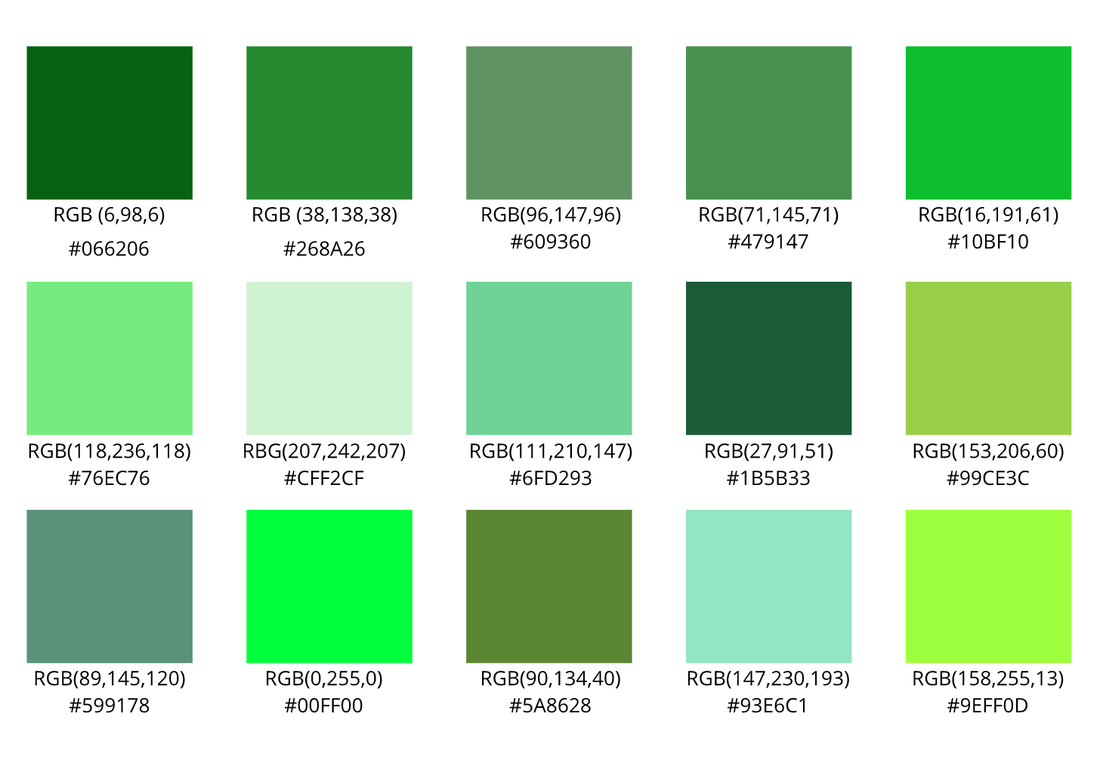 color schemes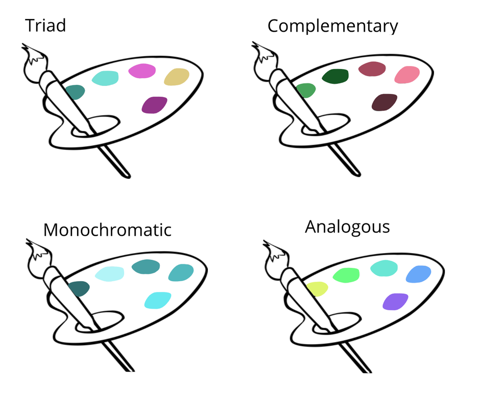
0 Comments
Typography is the visual component of a written word. Typography is important because the font you choose signs what mood or style of writing your writing. If the writing and the font don't match, people won't be intrigued to read it. Each font has a different personality and purpose means each font portrays different things. Some are more formal, some are more fun, some stand out, etc. Serif, San Serif, Monospaced, Handwritten, and Display are the 5 different kinds of fonts. Serif fonts have "feet", whereas San Serif don't. Serif would be used in more formal writings, and San Serif would be less formal. For monospaced fonts, each letter takes up the same amount of space. This font is often used in coding. Handwritten fonts are cursive, calligraphic, or handwritten. Script/handwritten fonts can be used for children, fancy notes, or any other short thing. Display texts are more popping and are used to grab people's attention. They can be used as headings and titles to catch peoples' attention. Typeface comparisonFor my Typeface Comparison activity, I used the five different fonts: Serif, San Serif, Monospaced, Handwritten, and Display, to write "good morning" in different fonts. 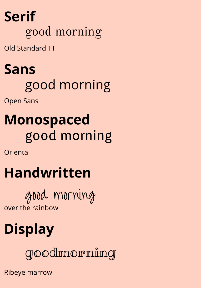 Word portraitsFor my Word Portrait activity, I chose 10 different fonts and wrote 2 different words to write in the font. I chose one word that seemed to fit the font and another that's not or the opposite. 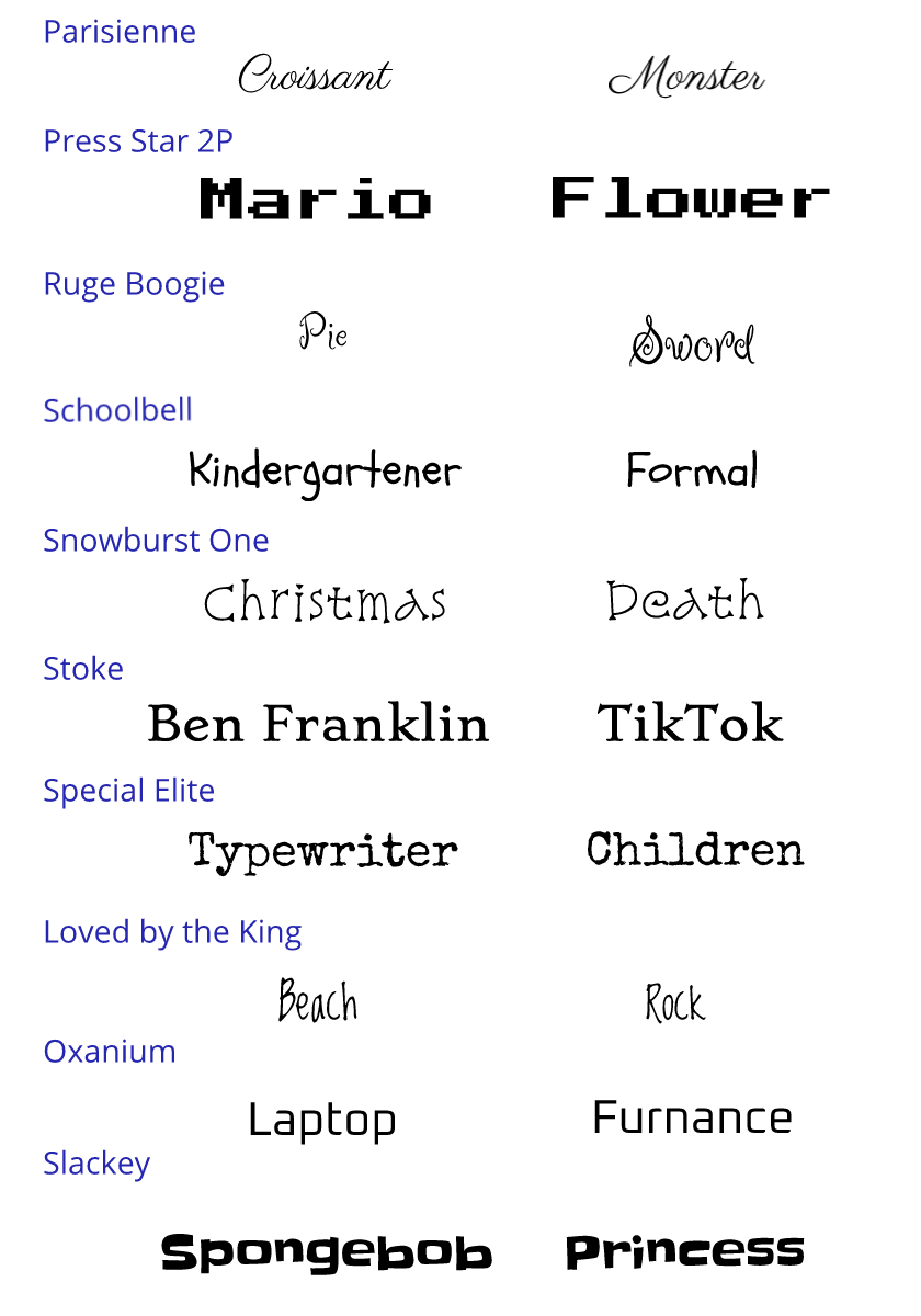 In these exercises, I was assigned to makes shapes using the pen tool in Gravit, and also to clip images. The pen tool is a tool in Gravit that can be accessed by presses 'p'. It helps create straight lines, curved lines, and to transition between those two lines. My final image was a combination of two images. I used the pen tool to cut out the person in one of the photos. Then I used the clip tool to add the person onto the shelf picture. A challenge I went through was remembering when to let go of my fingers after I press the option button. Sometimes, I took my fingers off at the wrong times, so the lines looked weird. Another challenge I went through was completing cutting out a shape with one line. Although I was frustrated sometimes, I still had a generally fun time! 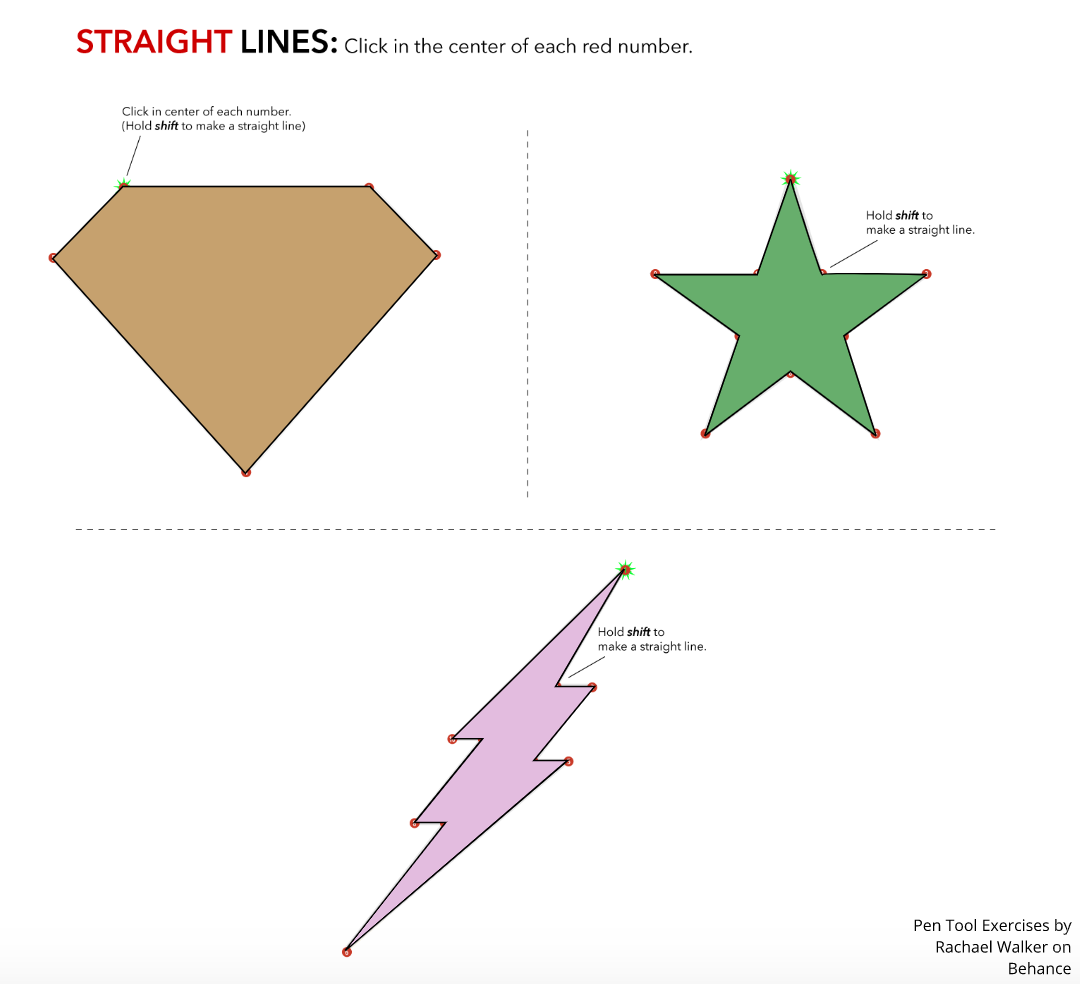 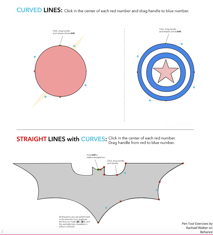 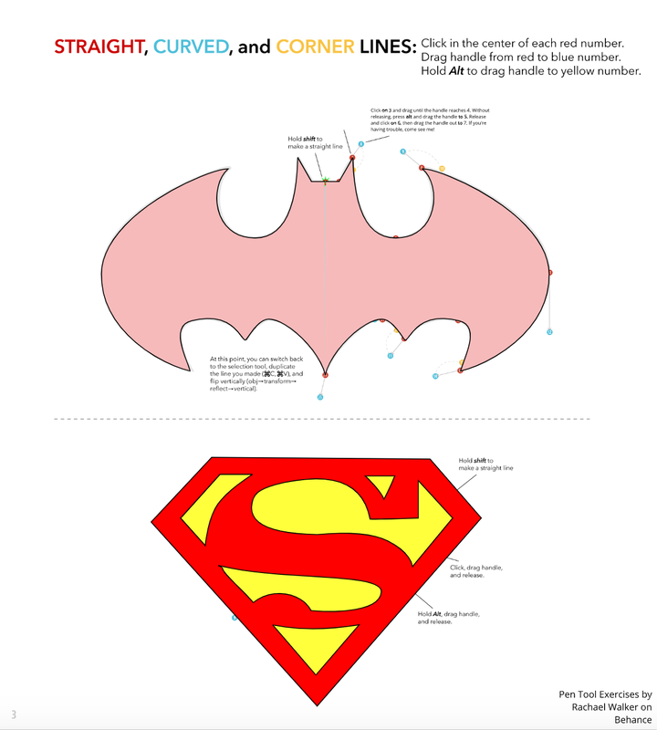   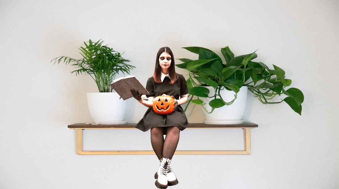 Pizza is meaningful to me because it's yummy. Whenever I'm feeling lazy, or don't have an appetite, I know that pizza will always be available, and that it will always taste good. Additionally, pizza means that my family is going to do some fun activity, which is always fun. It also means hanging out with friends, which is always fun as well. 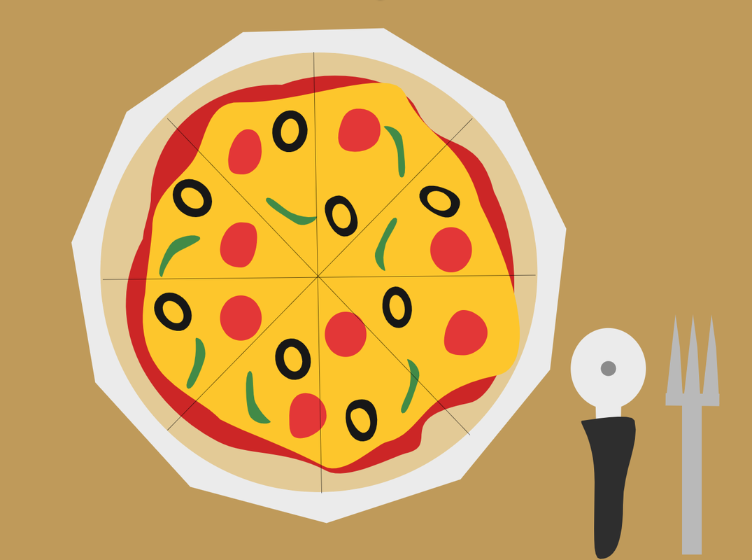 From this lesson, I've learned how to adjust corners, and overall modify a shape's look. I also learned different ways to compound two shapes. 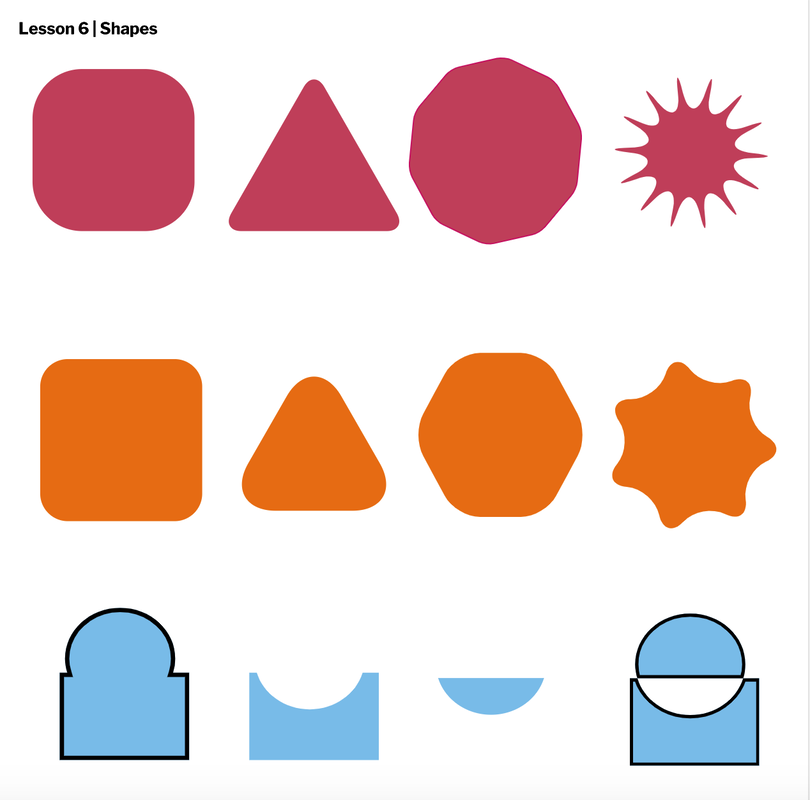 In this lesson I learned how to group shapes together and move them together or separately. I also learned how to switch the layers of shapes and how I can change the alignment of shapes. 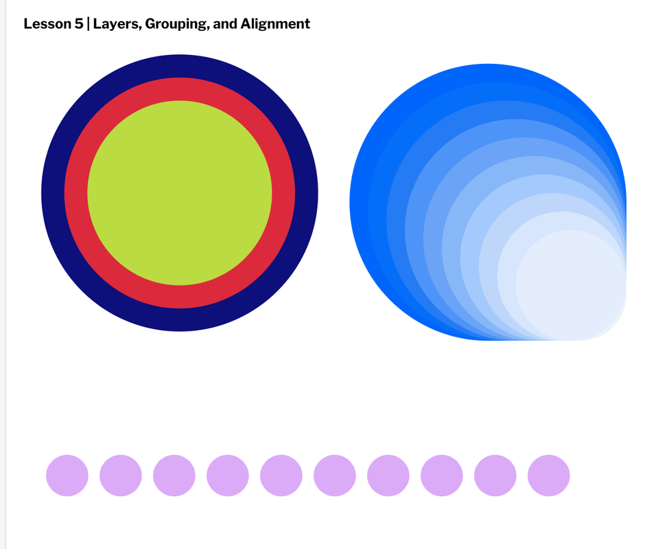 I've learned how to make different shapes and adjust them. I also learned how to use paths. 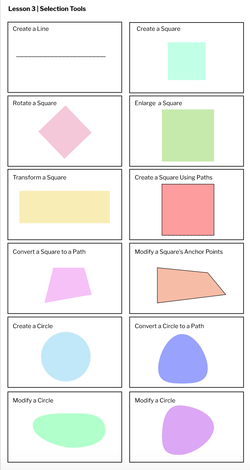
In this lesson I learned how to make dotted/dashed lined borders and borders for different shapes. I also learned how to make a shape less opaque. 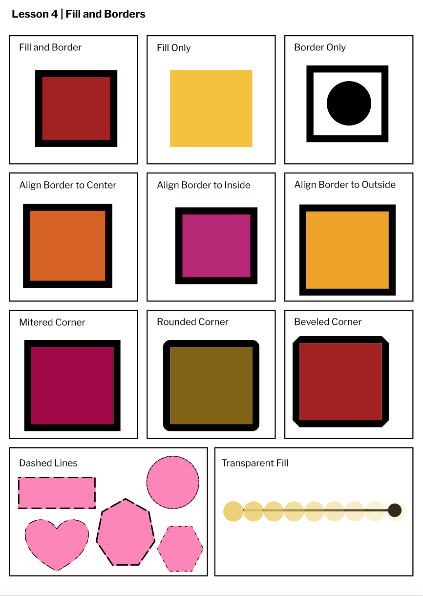 I've learned how to change page sizes, change units, change fonts, and adjust font sizes in Gravit. I also learned about autosaving on Gravit. 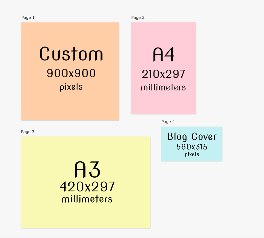 My drawing is an abstract drawing. There are circles, triangles, and lines all over the place, but still in somewhat of a neat way. I drew a smiley face in the center just because I felt like it and it made the drawing still have a center piece. Even though it kind of broke the abstractness, I thought it was just fun to draw. I drew this because I think I'm currently liking the abstract drawing style. From this activity, I learned many things. First of all, I learned all of the basics; how to make a circle, triangle, and many other shapes. Another thing that I learned connects to "real life," and that is that there is a lot of work that goes behind the scenes of seemly simple and normal things. 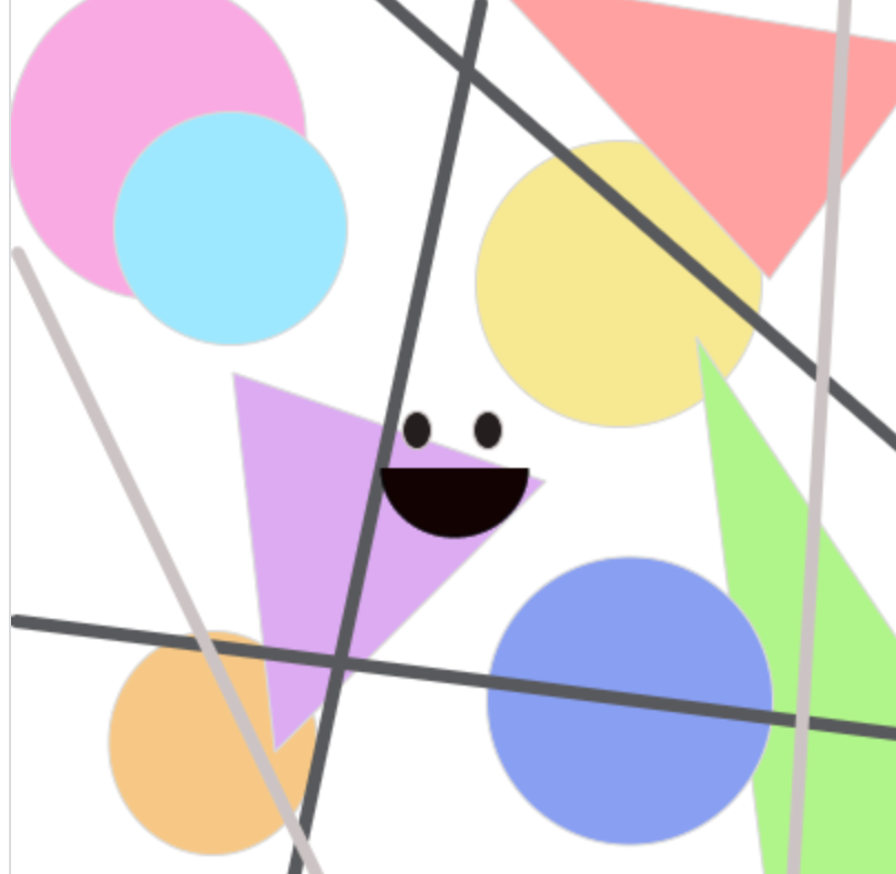 MY CODE:
//abstract part strokeWeight(1); stroke(217, 217, 217); fill(250, 170, 229); ellipse(66,66,134,144); fill(158, 232, 255); ellipse(99,106,105,105); fill(247, 233, 140); ellipse(274,131,129,129); fill(247, 200, 129); ellipse(91,338,94,101); fill(220, 171, 245); triangle(100,171,119,342,241,220); fill(176, 245, 130); triangle(539,500,309,155,380,720); fill(137, 159, 245); ellipse(279,319,129,130); fill(255, 161, 161); triangle(342,129,418,25,215,-8); strokeWeight(6); stroke(88, 89, 92); line(161,-4,698,462); line(122,424,212,4); line(2,283,416,336); strokeWeight(6); stroke(204, 196, 196); line(3,117,165,454); line(377,-13,352,409); //face strokeWeight(1); fill(36, 30, 30); ellipse(183,197,13,17); ellipse(215,197,13,17); stroke(0, 0, 0); fill(18, 2, 2); arc(200,214,66,62,1,180); |
Archives
January 2021
Categories
All
 This work is licensed under a Creative Commons Attribution-NonCommercial-NoDerivatives 4.0 International License. |
